Issue 18302
Dataset stats pie chart with extra circle
18302
Reporter: rdmpage
Type: Feedback
Summary: Dataset stats pie chart with extra circle
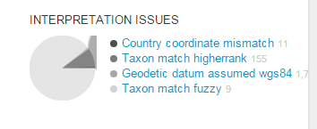
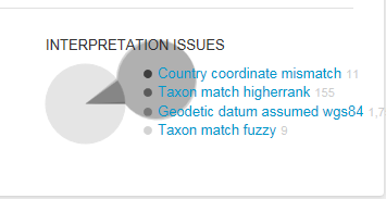
Description: Looks like an issue with the pie charts on the stats page for a dataset that is most obvious in Internet Explorer but also occurs in Chrome and Safari. In attached screenshot note the large gray circle that appears behind the text. It's clearly visible in IE 11. In Chrome (Windows 7) and Safari (Mac OS X) the circle is greatly truncated (second attachment). See http://www.gbif.org/dataset/6cc9b613-5f76-4654-9270-6eed8f57a34e/stats for example, and attached screenshot (IE 11, Windows 7)
Resolution: WontFix
Status: Closed
Created: 2016-03-02 09:52:48.38
Updated: 2017-10-06 10:18:28.503
Resolved: 2017-10-06 10:18:28.482
Attachment chrome stats.PNG
Attachment stats.PNG
Author: rdmpage
Comment: Dang, I reported this and was hoping this would be automatically linked to my JIRA account (sigh).
Created: 2016-03-02 09:54:08.258
Updated: 2016-03-02 10:03:01.12
Author: trobertson@gbif.org
Comment: Linked now [~rdmpage]
Created: 2016-03-02 10:26:06.51
Updated: 2016-03-02 10:26:06.51
Author: mblissett
Created: 2016-03-30 11:41:13.913
Updated: 2016-03-30 11:41:13.913

This is probably a bug with the library we're using, Raphaël.

The extra circle is actually an almost complete sector. To draw a sector >180° the SVG flag large-arc-flag must be set, but this changes the positioning.  Also setting sweep-flag corrects the position.

But, regardless, it doesn't make sense to display issues using a pie chart.  It would only makes sense if every record had exactly one issue. A small bar chart would be better.