Search filters: position checkbox before filter name
12511
Reporter: kbraak
Assignee: mdoering
Type: Improvement
Summary: Search filters: position checkbox before filter name
Environment: Firefox 17.0.1 Mac OS X
Priority: Minor
Resolution: Fixed
Status: Closed
Created: 2012-12-06 18:02:21.165
Updated: 2013-08-29 14:45:53.029
Resolved: 2012-12-07 12:55:38.454
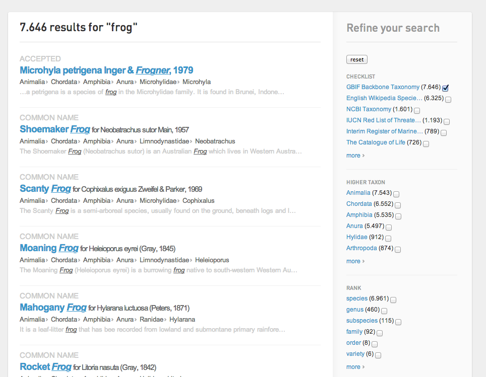
Description: Take a look at the attached screenshot showing the search filters, that can be selected by checkbox.
At least in the list of Checklist names, the length varies quite a lot, and it looks quite bad with an entire line being dedicated just to a checkbox (see screenshot).
An improvement to make the display nicer, would be to position the checkbox before the filter name, so that all the checklists align in a vertical line down the right hand sidebar. ]]>
Author: mdoering@gbif.org
Created: 2012-12-07 11:27:49.93
Updated: 2012-12-07 11:27:49.93
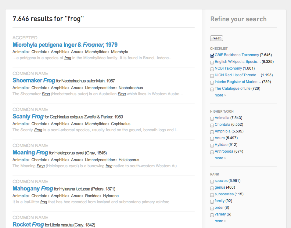
Agree that doesnt look nice. We abreviate the titles, but dont take into account that the counts can vary and for large numbers we are getting line breaks. We should calculate the abbreviation length including the count size, that would solve the line breaks.
Regarding the boxes I agree its better looking if they are all aligned. But then this needs to be done all over - at least also in dataset search. Worthwhile? Actually not too hard to do
Author: kbraak@gbif.org
Comment: I think it is worth trying for comparison at least, IMHO.
Created: 2012-12-07 11:45:24.951
Updated: 2012-12-07 11:45:24.951
Author: mdoering@gbif.org
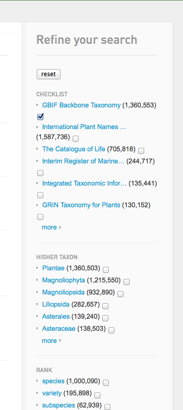
Comment: Ive got the dynamic length issue settled, much better already. Attaching a screen with the select boxes in front and at the back, not sure which I actually prefer
Created: 2012-12-07 12:22:36.704
Updated: 2012-12-07 12:22:36.704
Author: kbraak@gbif.org
Created: 2012-12-07 12:38:48.703
Updated: 2012-12-07 12:38:48.703

In a small focus group including JL, AH, and MR it was a clear-cut consensus: adjusted to the front is best. Reasons given include:

1. It is easier to select multiple checkboxes, moving down a straight line without having to zig-zag searching for the boxes.
2. Since a user would probably spend most time navigating the left search result list, it would mean less mouse-travel checking boxes at the front, instead of having to move the mouse all the way to the back.

It was also be nice to have a deselect all button.
Author: mdoering@gbif.org
Created: 2012-12-07 12:45:22.962
Updated: 2012-12-07 12:45:22.962

ok, Ill commit the front version then.
I think the reset button is good enough for deselecting. I doubt someone will add many, many filters really so that will become an issue. Id prefer to leave that to real user feedback as yet another link is increasing visual complexity for this already complex page.