occurrence search: improve user friendliness of choosing and applying filter
12627
Reporter: kbraak
Assignee: omeyn
Type: Improvement
Summary: occurrence search: improve user friendliness of choosing and applying filter
Priority: Major
Resolution: Fixed
Status: Closed
Created: 2013-01-22 16:30:36.083
Updated: 2013-08-29 14:45:53.353
Resolved: 2013-03-01 09:14:00.703


Description: Problems:

a) Currently the filters are listed in a drop down list appearing in the top right hand corner.

b) Currently an APPLY button is associated with each filter section, and it isn't clear if pressing one will apply all the other filters at the same time.

To improve problem a), we should try different layouts of the filters available to choose from. [~fmendez] suggested a tabular view.

To improve problem b), we could have a single APPLY button at the top/bottom of the layered filters (filters get layered on top of each other one after the other).]]>
Author: mdoering@gbif.org
Created: 2013-01-22 23:04:20.681
Updated: 2013-01-22 23:04:20.681

Im not sure if I understand problem a). The filter list works fine for me, can you explain the problem a bit more?

For b) I would suggest to apply any modified filter directly without the need to press any apply button. Just as we do when adding facet filters or removing an occurrence filter.
Author: kbraak@gbif.org
Created: 2013-01-23 11:01:06.781
Updated: 2013-01-23 11:01:06.781
Regarding a)
Every time a user wants to add a new filter, they need to scroll across to the top of the page, expand the drop down list, select a filter, then they need to scroll back across the page and try to locate the corresponding filter section. If the user tries to add a filter they have already chosen, nothing happens.
I describe this current workflow as inconvenient for these additional reasons:
-To remind oneself about available filters, they need to expand the drop down list first.
-The actual filter sections are generally aligned to the left of the page. That means when adding multiple filters, the user is navigating left and right, up and down excessively.
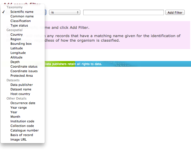
-The filters aren't logically grouped in any way to help the user understand what they can be used for. For example, Location and Country could be grouped into Geospatial. See the attached screenshot from the Old Portal showing how its filters are grouped.
Regarding b)
When you have a user that knows exactly what filters they want to apply, it's more convenient to let them choose all filters, and then apply them. If they have 5 filters, and they are being applied directly, you have just imposed 5 times the waiting time.
On the other hand, applying filters directly will help the user understand which filters are responsible for bringing back no data. The best approach is to apply them successively in this case, I agree.
Author: mdoering@gbif.org
Created: 2013-01-23 11:17:43.456
Updated: 2013-01-23 11:18:41.774

re b) a quick copy from POR-481 that should make things easier:

??If we remove the apply buttons and issue a new search straight away (see POR-480) we can also enforce only one open filter entry block at a time. For example if a user opens the basis of record filter but does not select any entry but instead select a new country filter from the drop down the basis of record block can be closed, so only the country filter and current filters block are visible.??
Author: kbraak@gbif.org
Created: 2013-01-23 14:42:14.184
Updated: 2013-01-23 14:42:14.184

Looks like we have several options to solve b) and improve the current design:

1) one open filter entry block at a time & apply any modified filter directly _without_ the need to press any apply button
2) one open filter entry block at a time & apply any modified filter directly _with_ the need to press the-one-and-only apply button
3) multiple open filter entry blocks at a time & apply any modified filter directly _without_ the need to press any apply button
4) multiple open filter entry blocks at a time & apply any modified filter directly _with_ the need to press the-one-and-only apply button

My vote is still 4) but I'm probably just most worried about performance concerns applying multiple successive filters (unnecessarily for users who know exactly what set of filters they want to use).

[~fmendez@gbif.org] can you please give your opinion? I'm curious especially about performance concerns, if there are any.
Author: mdoering@gbif.org
Created: 2013-01-23 14:58:01.793
Updated: 2013-01-23 14:58:01.793

As the only true concern against 1) is performance I would propose to go with solution 1) for now and monitor if that really becomes and issue. And if so we should try first to improve the search performance.

If nothing helps I can see another way around that without making the UI more clumsy: asynchroneous loading of search results. This allows the search filters to be worked on while the search is still running.
Author: fmendez@gbif.org
Created: 2013-01-23 17:13:27.357
Updated: 2013-01-23 17:13:27.357

I agree that some aspects about the design must be changed, in particular:
 1) Looks like all of us agree that only one filter should be shown at a time
 2) We have to decide if the page will process filters in batch or 1 at a time.
   Performance: if we process 1 filter at a time, the general waiting time will be longer that the batch option; the average response time of query with 'n' filters is very similar to the    one with 'n   m' filters. For example if a user wants to specify a query with 8 filters and if the average response time is 2 secs per query;  means that for the interactive approach (1 filter at a time) will wait 16 secs in total, while with the batch approach the user will wait ~ 2 sec   the time of constructing the query in the UI.

   Usability: i think that the single filter approach is more suitable in any case and particular when the user is trying to narrow the result set (like amazon, ebay, etc.) and navigate thru it using a faceted search; however, the initial UI design was done thinking that the user would specify the filters in batch.

There's 1 aspect that looks to me inconsistent in the current implementation: the occurrence filters have to be specify in batch but can be remove 1 at a time (interactively).

Finally i think that what we really have to decide if the UI will handle the filters interactively or in batch for any case: my opinion is that the interactive option is better; maybe we can test it and validate how it performs.

And definitely we should ask other people about their opinion about this: maybe Andrea and Tim are good candidates.

In summary option 1) is the best approach but probably 4) is more realistic by now.