18120
Reporter: kylecopas
Assignee: bko
Type: NewFeature
Summary: Button to download/open country report
Priority: Critical
Resolution: Fixed
Status: Closed
Created: 2016-01-05 13:47:28.106
Updated: 2018-05-31 16:24:09.662
Resolved: 2018-05-31 16:24:09.619

Description: As a reminder...once the updated year-end 2015 country reports are available, we should not only swap them in for the PDFs available at
http://www.gbif.org/country/XX/summary

but also make them publicly accessible by adding a mechanism for downloading and/or viewing them. A link or button would be preferable to adding a tab. Perhaps it could be a color block/bar with a very brief explanation and link to the PDF. Happy to help with design and placement as desired, but regardless, these should appear prominently somewhere (above the fold?) on the country summary page.]]>
Author: bko@gbif.org
Created: 2016-01-22 10:20:21.758
Updated: 2016-01-22 10:20:21.758

I suggest we for the current version could follow the data download page for the style and placement of the "download" block, i.e. http://www.gbif.org/occurrence/search?HAS_COORDINATE=true&HAS_GEOSPATIAL_ISSUE=false

, and, the small block should appear regardless at which tab users are. Does it make sense? Would the block be big enough to host the brief explanation you'd like?
Author: kylecopas
Created: 2016-01-22 10:54:33.248
Updated: 2016-01-22 10:54:33.248

Yes, I think that's an ideal repurposing. I think the order might flip, that is, with the 'download' button above and something like 'Latest country report' below?

Do you want it mocked up before you build it, or is it easier just to go there?
Author: bko@gbif.org
Created: 2016-01-22 12:48:46.947
Updated: 2016-01-22 12:48:46.947

If the text would be only "Latest country report", it's pretty clear to me and a mock up may not be needed.

However, are you sure about flipping the order? It might create UI inconsistency IMO. And, putting "download" button above the text might increase the chance that visitors click it before reading the text, which may in turn affect the stats of our site analytics. Or, I may miss something...
Author: kylecopas
Created: 2016-01-22 13:27:13.147
Updated: 2016-01-22 13:27:13.147

I probably asked about mockups because I myself am unsure how it will look. Keep with the consistent UI, try 'Latest 12-month report' as the text, and let's have a look.

The reports themselves carry an explanation. Fingers crossed that that's enough.
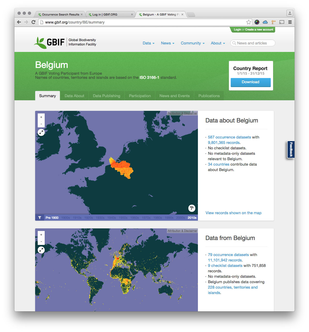
Author: bko@gbif.org
Comment: The country report download button will be styled according to the attached image.
Created: 2016-02-01 10:07:30.776
Updated: 2016-02-01 10:07:30.776